Cervisiam
I first started working with Cervisiam Brewery when i studied at Hyper Island in Stockholm, as a part of a student project. Our project was to run our own agency, and find our own clients.
I had been talking with the owners before the project, and knew they wanted more of a red tread and a brand book for the company.
After I finished my studies in Stockholm I got hired to work In-house as an Art Director for the Brewery and to rebrand
and make the whole design more minimalistic. After finding the path for the rebranding, my main tasks wa to make can designs and social media posts.
Here is some of the ideas and designs i made.
One of the first things that needed to be redesigned in the rebranding process, was the logo. The old logo is a nice illustration but difficult to use as a small logo. The new one is a much simpler logo, but it has roots in the old one.
Logo
Can Design
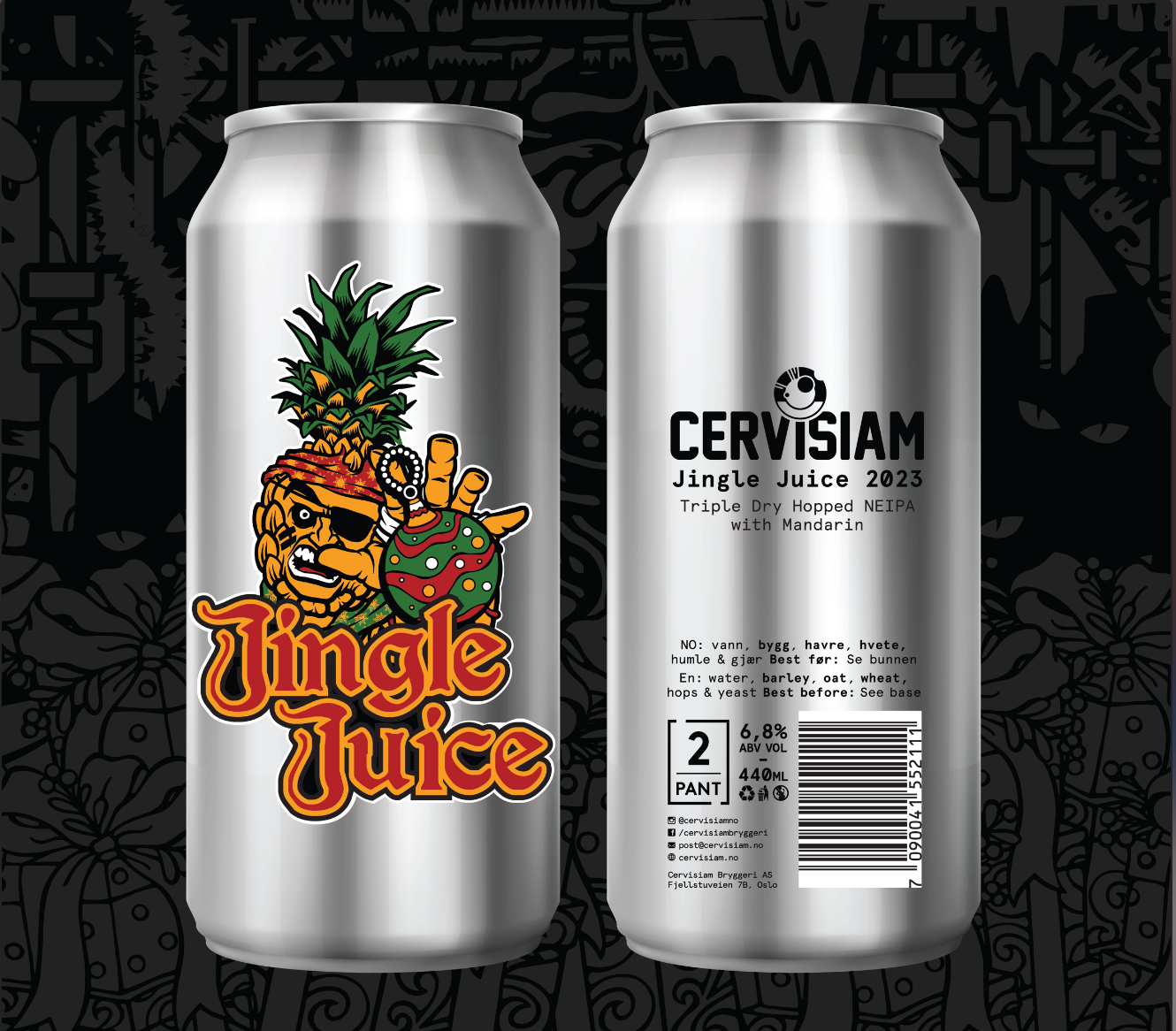
Some of the old designs:
The old can design was revolutionary when Cervisiam started in 2015. A lot of things happening on the can and it stood out in the shelfs in the shop. But later years more and more breweries have followed the same recipe, and it can feel like a nuclear impact of colors when you come in to the beer shop. The old designs was great, but it was time for a little more minimalistic approach.
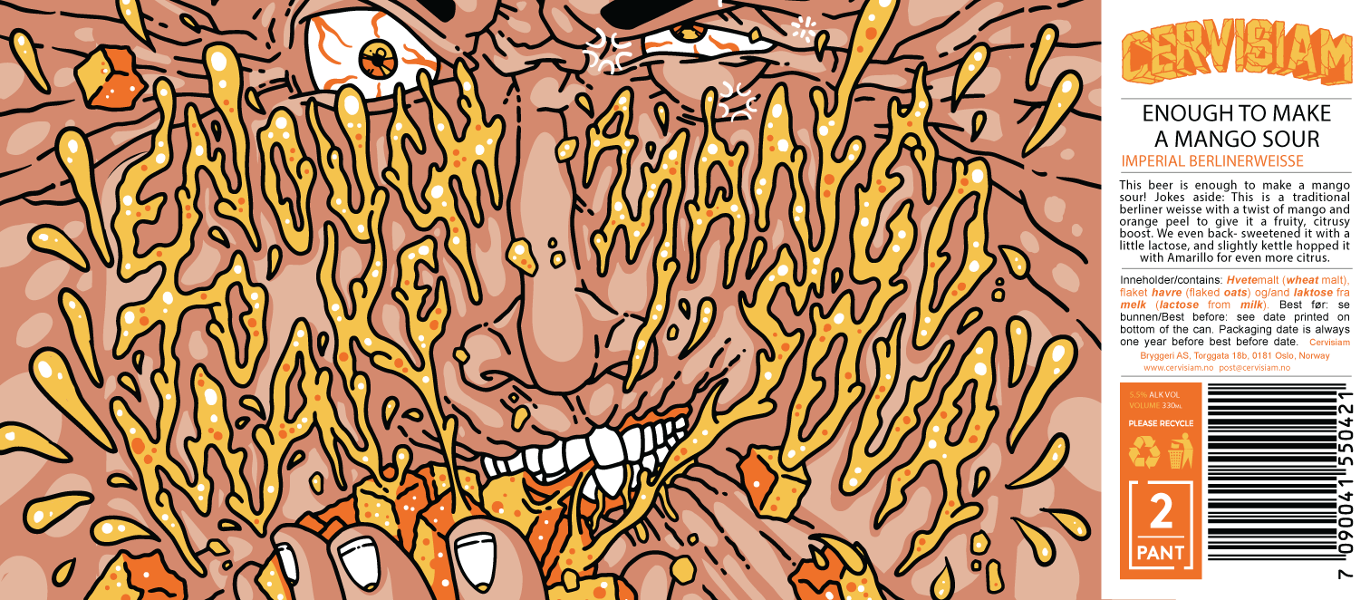


The idea we landed on when I was designing the new cans was to have it look like old Cervisiam, but in a more minimalistic design and use the color of the can as the background color, with the focus on the illustration.